


‘One’s prime is elusive. You little girls, when you grow up, must be on the alert to recognise your prime at whatever time of your life it may occur. You must then live it to the full.’
Whisper it, but sometimes it’s ok to judge a book by its cover. In a new regular feature for BooksfromScotland we will delve into the stories behind the creation of the covers of some of Scotland’s most arresting books. Our first Cover Stories feature focusses on Muriel Spark and the gorgeous editions published by Polygon throughout Spark’s centenary year of celebrations. Designer Teresa Monachino, tasked with coming up with a series design for all 22 Spark novels, takes us through her creative process. . .
The Spark Centenary Editions
by Muriel Spark
Published by Polygon
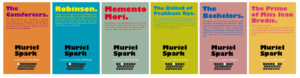
One author. 22 novels. Where to start. With the author, of course. It’s the one thing that all 22 books have in common. It sounds obvious and it is obvious.
As a designer, however it’s important not to ignore what’s right there in front of us. Had I read any of Muriel Spark’s books; no. Thankfully, however, a lot has been written about her, from countless book reviews and interviews, to her 2006 obituary. It wasn’t difficult to assemble a picture of Muriel Spark, her life and her work and why she matters. I was, of course, given a design brief by the publisher from which I identified the following core values:
One of the world’s great writers
The writer’s writer
Controversial
Vivacious
Witty
Sharp
Waspish
Stylish
Modern
Cosmopolitan
There were a few design pointers that were particularly helpful: “representative, abstract, bold, unafraid of space … ”. And “sharp, stylish, modern, cosmopolitan … punch and panache … modern too to appeal to a younger generation being introduced to Spark …”.
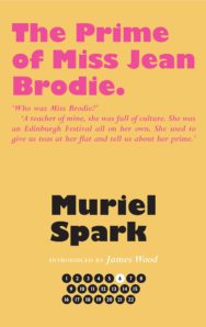
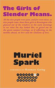
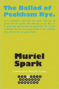
Making a start I focused on the most famous and well-known of the 22 novels; The Prime of Miss Jean Brodie, the sixth book in the series. The one thing that I kept in the front of my mind was that Muriel Spark was ‘the writer’s writer’. I read the 22 blurbs that accompanied each story and I knew then that the work should speak for itself. If we mustn’t judge a book by its cover then we must judge it by its words. What happens then when the words are the cover? I proposed that the book blurb should be on the jacket cover so that the design lets the stories speak for themselves; they need no further embellishment, it’s all in the writing.
A designer must consider everything from paper to typeface to colour and with a typographic design, typeface choice and styling is crucial.
Typeface
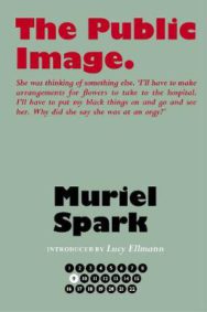
I used Gill Sans but not as we’re used to seeing it; Gill Sans Ultra Bold. It’s quirky, witty and unashamedly prominent; a good representation of some of those core values. To complement the typeface I selected one of Eric Gill’s other faces; Perpetua, typeset in italic. Like Gill Sans, it too is very distinctive and, as sans serif and serif, they partner each other beautifully. The author is also shown in Gill Sans Ultra Bold. The title is given a full-point; definitive, end of, while also referencing the written word and narrative. The blurbs were moved to the front cover flap, where they would usually be found, and an intriguing extract from the book was selected to go under the title, maintaining the emphasis on story. The author is the constant and always appears in black and without the full point. This keeps the storytelling, written element, within the top half of the cover and makes for a cleaner layout.
Colour
The colour palette; a selection of colourful earthtones flood the background, very vintage, faithful to the eras in which the books were written, while the titles and extracts clash in vibrant contemporary brights.
The Paper
My first paper choice was GF Smith’s Tapestry Collection. A patterned/textured paper; like linen with a silky sheen. There simply weren’t enough varieties to stretch to 22 books from this collection so I chose a Fedrigoni Fine Art Paper, Arcoprint 140 gsm, an uncoated paper with a tactile vintage book jacket feel.
Collectable
The stylised typewriter key inspired graphic encourages the reader to buy and collect them all. ‘The writer’s writer’; this section of the design suggests a typewriter/keyboard/screen, the author’s name appearing on the paper or display area.
The elements of the design are simple. 6 background colours and 6 title and extract colours which repeat. It’s worth bearing in mind that book series are often displayed face up on a table or even face out on a shelf. The more variety on show, while demonstrating that they’re part of a set, the better.
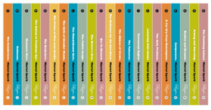
On the back cover appear 5 Muriel Spark photos that span the era in which she wrote her novels; the 1950s, 1960s, 1970s, 1980s and 1990s. These were identified and placed on the back cover in chronological order along with quotations from various sources in praise of Muriel Spark. But that’s not the end. It’s not all about fronts and backs. What about the book spines? Carrying the complete colour scheme on to the spines proved to be far too garish so I looked at how the collection could be more uniform. By making all the titles on the spine white the set is now unified. T H E N O V E L S O F M U R I E L S P A R K that’s a very pleasing 22 letters and here they are, one at the top of each spine. Likewise, for consistency, the author’s name appears in exactly the same place regardless of the length of the book’s title.
Last word goes to Muriel Spark: “Sooner or later I do what I want to do”.
The Spark Centenary Editions are published by Polygon, priced £9.99 each


ALSO ON BOOKS FROM SCOTLAND
-


Pink Camouflage by Gemma Morgan
‘I had to tell this story for the thousands of other women who have been harmed by the toxic culture …
-
The Hollow Tree by Philip Miller
‘The man turned around. His hands were dark with blood.
-
David Robinson Reviews: All Before Me by Esther Rutter
‘This then is a book about recovery, about regaining self-confidence and rediscovering joy.’
-
QuickFire, Slow Burning by Janette Ayachi
‘Things are shed when people listen to poetry.’
-

‘But best of all it is dead silent: no sound of greetin’ weans, no shouting staff, no screaming- dru …
-

‘If readers enjoy what you’ve written, they’ll keep on coming back for more.’
FEATURED AUTHOR:
Lindsay Littleson

Lindsay Littleson is a primary school teacher in Renfrewshire, Scotland. Since taking up writing for children in early 2014 she has published a short story with Walker Books, in addition to winning the Kelpies Prize with her first children’s novel, The …
FEATURED PUBLISHER:
Luath Press
Luath Press takes its name from Robert Burns, whose little collie Luath (Gael., swift or nimble) tripped up Jean Armour at a wedding and gave him the chance to speak to the woman who was to be his wife and the abiding love of his life. Burns called one …